Uncategorized
波兰Kraków 公布城市新Logo

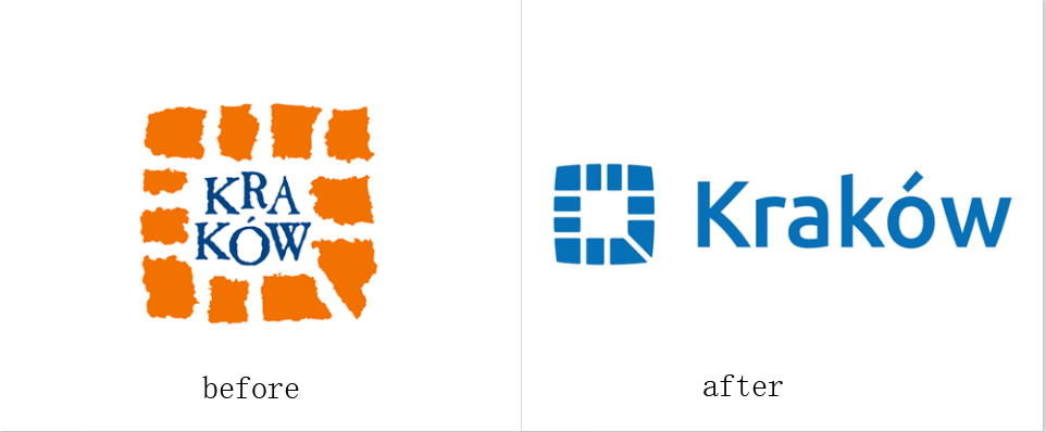
城市logo, 这是一个城市形象的推出,从过去的老形象推广到新形象的都是由同一个设计师设计。从logo中也体现了现代化的都市发展。

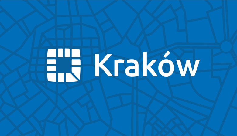
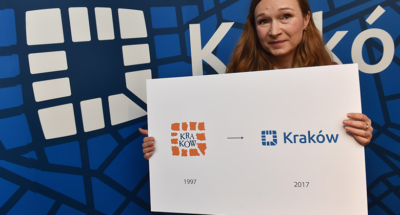
The author of the modernization of the logo is Dorota Kozak, who 20 years ago won the competition for the then logo of Krakow. The main assumptions of the modernization of the logo are associated with the changes, which is ongoing – changing places displaying graphic characters, it has become ubiquitous to use computers, smartphones and applications. It all meant that it was time to do a facelift and modernization of the logo Krakow. Work on it lasted half a year, were led attempts to change the character, so that the people recognize and associate proposal to Krakow, but in a modern line which follows the spirit of the time. The new symbol is simplified, and the name “Krakow” was pulled out of the symbol, which greatly improved readability. Signet, which is itself a sign showing streets extending from the main square can be used without the addition of the name “Krakow”, because in the applications space designed logo is a circle or square, in which fits perfectly with the new logo of Krakow.


